My "Truthoid" is that ECA had a rifle range in 1914. So my story would include somebody practising on the range, but they would fire a number of shots, but each of them being extremely fancy and ridiculously posed. The target sheet would then be exposed to show "In 1914, ECA had a rifle range" or something of that sort.


So i set out to design this "fancy rifle man". I wanted him to feel classicly hanndsome, over the top, yet sort of sleek and feminine and camp, able to pull a ridiculous pose. My idea was to have him be military influenced, firstly because of the context of a rifle range, but also as a kind of humour - the incongruous pairing of camp and military - of course its all very stereotypical depictions and what not. A few things come to mind:

The gun - a 1914 Enfeild.

Appropriate for the period, etc.

In terms of the poses, I wanted to create something so over the top and hilarious. I looked at Kate Beaton and the Hawkeye initiative.


EMPOWERMENT
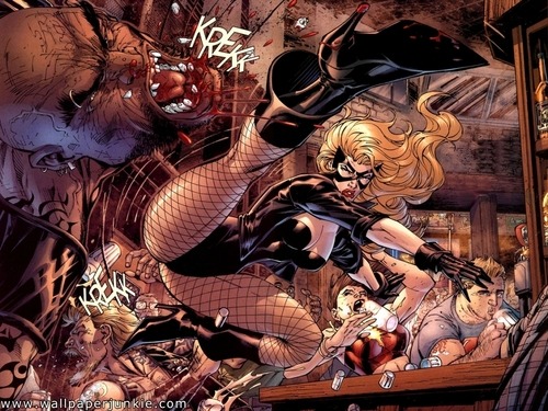
The Hawkeye Initiative again sets out to illustrate the highly problematic way in which women characters are displayed in superhero comic books. By replaces ridiculous poses from female characters with the hero "Hawkeye" or "Clint Barton". Hilarity ensues. "How to fix every Strong Female Character pose in superhero comics: replace the character with Hawkeye doing the same thing." - Noelle Stevenson.
I really enjoyed the idea of the masculine body doing a overtly sexual pose reminiscent of a female. I wanted to incorporate that.


Just look at how fabulous he is.
He seemed to be quite typical of what an art student soldier hybrid would be. Quite rebellious using elements from old uniforms in his own (shoulder pads) as well as the scarf, and an evident inability to take anything seriously.
Next i attempted to animate him. I wanted these poses to be the centre of attention, so i wanted to keep the movement between them at a minimum. I had a few frames of movement between them, but the effect was just not convincing, i don't think i was quite cut out to convincingly animate such an elaborate figure at this stage. So to accommodate this i decided to the classic "snap" between poses, filling in the path between the two resolutions with a solid object. However, it was extremely difficult to correctly draw the shape as again, it was quite a complex structure. The result didn't look convincing even with more exaggerated movement. As a result of these experiments i decided to stick with no animation between the poses at all. He would just cut right to the next one in the sequence. This is where the scarf comes in. It was originally a decoration that i was going to cut as it would take too long to animate. But now that I wasn't animating the figure, i decided that it would be perfect to display the movement of the figure.
Once the figure + scarf were animated i thought about colouring. With the rebellious art school theme, i thought that his touch should be a bright red scarf. This would also emphasise the movement of the figure. As for the outfit, i went through several colourings, and was happy with none of them. I tried him as pure white and it seemed to work a lot more effectively and was a far more striking image then. This meant however that the project wasn't going to be rooted in as much realism as i has originally planned.
I considered this when it came to my background. My original idea was to have the courtyard of eca in the background. But intead i considered maybe having the famous Kitchener poster in the background.
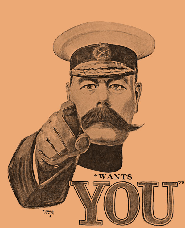
However this didn't look right, and was extremely confusing to view, and could probably be considered offensive. Earlier in the project, Jared had directed me to "Dazzle Camouflage" as an example of the interaction of Art and War.
_cropped.jpg/220px-USS_West_Mahomet_(ID-3681)_cropped.jpg)
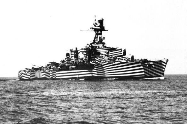

Dazzle Camouflage was a type of camouflage used in WWI created mainly by Norman Wilkinson. It was used not to hide the ship but to confuse the observer to its distance, speed and direction.
I felt that this was an appropriate looking background that had some interesting context. I created a few of my own:
My original plan was to have Bullet holes spell out the text "ECA had a rifle range in 1914". But this proved to be difficult and was aesthetically disappointing. So i thought that including the text as part of the dazzle camouflage was more fitting.
The final film:
My original plan was to have Bullet holes spell out the text "ECA had a rifle range in 1914". But this proved to be difficult and was aesthetically disappointing. So i thought that including the text as part of the dazzle camouflage was more fitting.
The final film:
No comments:
Post a Comment